
EVAIL: Alcoholic Energy Drink Packaging
EVAIL is a conceptual energy drink brand inspired by the seven deadly sins, translating emotion and human impulse into a bold, minimal packaging system.
Each flavor embodies a sin — not through literal imagery, but through abstract line forms, color psychology, and sensory-driven flavor profiles. The result is a cohesive yet distinct product range where each can visually expresses its personality.
The project explores how typography, minimal graphics, and restrained color palettes can communicate complex emotional themes while remaining commercially viable on retail shelves.
Concept
The core idea behind EVAIL is simple: sin as sensation.
Instead of portraying sins in an obvious or moralistic way, the design translates them into energy, tension, indulgence, or restraint. Each variant uses a set of flowing or angular line structures that visually “pull” toward a central form — symbolizing the internal gravity of each sin.
The system allows every flavor to feel unique while still belonging clearly to the same brand.
Project Category
Packaging / Mock Project
January 2026


Brand Voice
EVAIL speaks with quiet confidence.
The tone is sensory, restrained, and self-aware, leaning more toward the language of premium spirits or fragrance than traditional energy drinks.
Each flavor description is written as if the sin itself is speaking, giving the product range personality while reinforcing the conceptual narrative.
Visual Design
The packaging relies on a minimal visual system built from three core elements:
Abstract Line Forms
Each sin is represented through directional lines that stretch and converge into symbolic shapes. The lines feel as if they are being pulled inward — creating tension and focus on the center of the can.
Color Psychology
Every variant uses a distinct palette reflecting the emotional character of the sin.
Examples include:
deep red tones for Lust
sharp green for Envy
royal blue and gold for Pride
stark black and red for Wrath
Typography
The design pairs a modern sans-serif with a classic serif to balance contemporary energy with timeless sophistication.
Inter – clean, modern structural typography
Baskerville Old Face – expressive flavor titles
Flavor names appear prominently at the center of the can, while brand and flavor descriptors remain understated to maintain hierarchy.
Product Range
Lust — HEAT
Dark cherry, chocolate, and coffee liqueur.
Envy — EDGE
Kiwi, lime, mint, and gin.
Pride — BURN
Pineapple, ginger, and whiskey.
Gluttony — ZONE
Apple pie and cinnamon liqueur.
Wrath (MAX) — RISE
Blood orange, black pepper, and mezcal with increased caffeine.
Greed (Limited Edition) — OATH
Vanilla, salted caramel, espresso, and coffee liqueur.
Sloth — HALO
Alcohol-free blueberry, lavender, and chamomile.
Tools
Affinity Designer
Affinity Photo
DaVinci Resolve


Still curious?
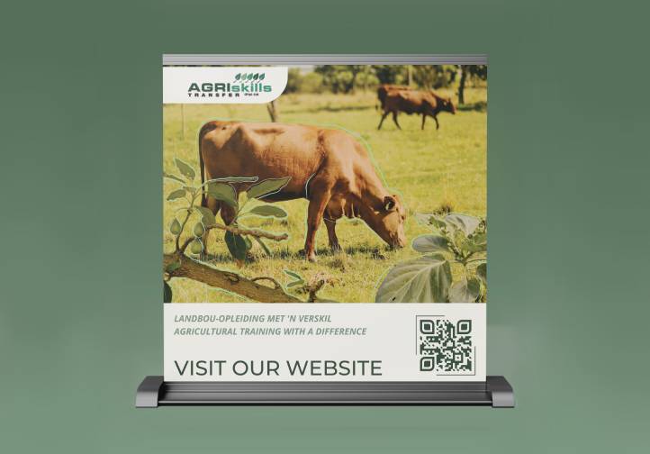
Agri Skills Transfer Banners

Animated Obsessions | Old Cars
Agri Skills Transfer Website
